


Branding Agency for Startups: How We Created a Heritage Brand Identity for an EdTech Company in 30 Days
- Victor Anferov

- Aug 12, 2025
- 4 min read
Updated: Sep 16, 2025
Strategic Context and Objectives

The founder of an IT school in Berlin approached us with a task that might seem contradictory at first glance: create a visual identity for a completely new brand while embedding the sense of a "company with history." This challenge arose in the context of launching online programming courses with ambitions to enter German, European, and US markets under tight time constraints — one month before sales launch.
The initial situation was characterized by having only a rough logo concept and the need for express redesign to form the foundation for long-term brand development.
Key strategic objectives included:
Creating a modern logo construction aligned with technological and EdTech company trends.
Preserving the brand's essential characteristics — technological innovation, team expertise, sense of history, and innovative approach to education — through appropriate visual metaphor.
Adapting the existing brand mark (eagle) while maintaining the primary color.
Developing derivative forms for digital media.
Creating a flexible compositional system for various application formats.
Establishing the foundation for a scalable corporate style with optimized budget for further development.
Our Branding Agency for Startups Approach: Pixelization as Digital Transformation Metaphor
The solution was based on the concept of "pixelization" of the brand symbol as a visual metaphor for digital transformation. This approach allowed us to demonstrate evolution from analog to digital, from traditional to technological education, while maintaining connection with the original symbolism.
The pixel as a basic system element solved several strategic tasks simultaneously. It created direct IT-context associations, ensured functional universality through its square format, generated connections with digital technology history, and enabled demonstration of transformation processes through visual metaphor.
The key advantage of the chosen approach was the ability to communicate complex concepts — from idea to implementation, from simple to complex — through an understandable and functional visual system.
Creative Implementation and Systems Thinking
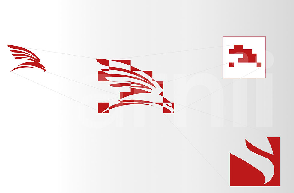
The pixel became the atomic element of the emerging proto-design system. At the intersection of detailed and abstract symbols, we defined a brand mark that integrated all mandatory elements and essential brand characteristics.

The result was creating a derivative brand mark with the possibility of varying abstraction levels depending on application context. This solution ensured preservation of the full brand mark usage in official communications while simultaneously adapting to digital platform requirements through abstract icons, backgrounds, and patterns.

The chosen strategy maintained connection with original symbolism while presenting it in the modern IT industry context. Given time constraints, the client was presented with one developed concept in two execution variants.
System Adaptability and Change Management

The project's implementation presented particular complexity due to naming changes: the final project name transformed several times during work following the pattern AIT Tel-Ran → AIT TR → AIT. Through brand mark form optimization, we created a universal logo construction based on the principle "brand mark + name + descriptor," which allowed overcoming naming change difficulties without altering the basic concept.

The typographic system was built on the Inter font, ensuring quality content display in English, German, and Russian languages. This solution was critical for international positioning in the multicultural European market environment.

We presented two logo versions: the first included italics as a reference to 1980s technology company aesthetics, the second offered a more conservative solution. The client chose the second variant, corresponding to positioning strategy as a serious educational project.


The color system was built on the contrast of primary colors — red, black, gray, and white — supplemented with accent colors to ensure flexibility in various communication tasks.
Results and Long-term Perspective
The created identity successfully solved the strategic task of forming a visual image of a company with history. The system demonstrated sufficient flexibility for adaptation to various media and formats, while the pixel concept organically integrated into the school's digital ecosystem.

To strengthen the "heritage brand" concept, we developed a photographic material stylization system using retro filters that imitate analog film aesthetics.
Currently, the client uses basic system elements: logo, Inter-based typography, and the main color palette. Additional elements — accent colors and retro-stylized images — remain in reserve for further development.
This situation illustrates the typical growing company problem of maintaining brand consistency. Main factors include responsible personnel turnover and insufficient investment in comprehensive branding system creation at early business development stages.
Strategic Conclusions and Experience Applicability
The project demonstrated the effectiveness of visual metaphor as a tool for communicating complex concepts. A well-constructed concept can create a sense of continuity and heritage even for a new brand, which is especially important in the competitive EdTech market environment.
Solution functionality directly determines its durability — the universal square logo format ensured applicability across all digital formats without losing perception quality. The created logo has been successfully living for three years now - July 8, 2022 can be considered the birthday of this corporate style - and is successfully used by the company for various digital media: from websites to mobile applications, which, by the way, were created by the AIT IT school based on the Wix Branded App solution as part of Wix Enterprise Solutions.

For international brands, the choice of universal typographic solutions capable of ensuring quality work with various language systems and cultural contexts is critically important.
The case demonstrates the possibility of creating conceptually grounded identity within limited timeframes, provided systematic understanding of strategic tasks and deep brand context analysis. The key success factor was focusing on creating a scalable system rather than one-time solutions.

Ready to transform your startup's brand identity? As a branding agency for startups, we specialize in creating compelling visual identities that tell your story and accelerate growth. Write to us about your brand redesign project or startup launch at welcome@parnii.de — we will offer customized cooperation options and show you how Wix Enterprise Solution can help your company achieve rapid business launch and sustainable brand development.


