


It sounded friendly a moment ago
A small experiment in context, with a font I recently made.

Put “Stay curious.” on a green poster in pink letters and I hear an invitation. Put it over a road disappearing into fog and I start wondering whether curiosity is a good idea.

The words are identical. So is the font. But the road gives the invitation somewhere to lead, and very little information about what might be waiting there. Suddenly, those soft letters feel a little less reassuring.
The font and words stay the same. Colour, imagery, scale and spacing change the reading

Hi.
I design for the web and experiment with type, code and motion. Sometimes a small detail turns into a project of its own. This font started that way.
Finding the edge
I tried this with Parnii Biotic, a display font I recently made using Plus Jakarta Sans as an open-licensed starting point. The original idea was a small family for web layouts: something expressive for headlines, something quieter for subheadings, and a cut for smaller text. I wanted to see how much character could come from the letters themselves.


Metaballs were an early reference: soft forms that appear to pull towards each other and gather into larger shapes. I was interested in the tension around their edges. The letters should feel organic, as if they had settled into place but might still move a little.
On the bright poster, that softness reads as playful. Against the fog, the uneven outline starts to feel unfamiliar. There is enough weight to hold the composition, and enough irregularity to leave its mood open. The rounded forms can be friendly without making every setting feel childish.

Getting there took a few wrong turns. Rounding the corners made the original font look softer, but the result felt too tidy. A regular wave introduced a pattern I kept noticing. Smaller fluctuations along the edge were more interesting: a swelling here, an indentation there. I had to keep putting them into words to see whether they worked.
A headline has to work on a page
A letter enlarged on a blank canvas can be convincing. A headline on a page asks more of it. The spacing starts to matter, the surrounding text competes for attention, and the same contour may barely register at a smaller size. The subheading needed to be judged as a subheading. Looking at everything large was hiding useful information.
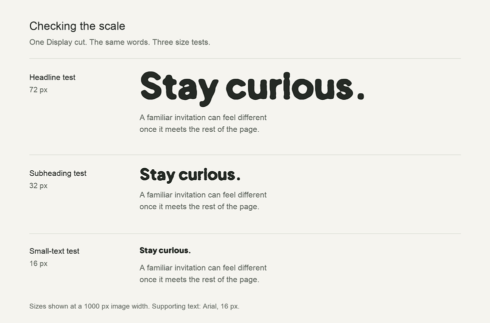
I moved between browser experiments, a small Python tool and installed font files until the processed contours travelled with the font. That made the two posters a useful comparison: I could keep the letterforms fixed and change the world around them.
The same forms, in motion
The display cut became the focus because it held the organic quality most clearly. In the motion study, those same fixed letterforms lift, rotate and settle. The gentle timing adds another layer of playfulness. Change the pace and the surrounding scene, and there is another direction to explore.
This is what keeps me interested in web design.
A photograph changes how a line of copy sounds.
A type choice changes how much space a section needs. Movement changes where attention goes next. The impression comes from how those decisions work together, and each adjustment can make me reconsider the others.
Having a direction helps me decide what to keep; knowing the tools gives me ways to try it. Sometimes that means changing the layout. Sometimes it means writing a small tool or taking the same words into a completely different setting. I still like both “Stay curious.” posters. I would follow the invitation in one of them a little more cautiously.
Sources and licence
Parnii Biotic Display is a modified font based on Plus Jakarta Sans, by The Plus Jakarta Sans Project Authors, and is released under the SIL Open Font License 1.1. Original copyright notices and the full licence are included with the font. Original project.
Atmosphere-study photograph by Keagan Henman on Unsplash. Cropped and colour graded; lettering composed in Python using the released Parnii Biotic Display font. View the source photograph.


