


How to make a Studio Two site responsive: breakpoints and Auto Mobile

Updated: 6 hours ago
In the Studio Two editor, you make a site responsive by designing each breakpoint from the top bar and managing them in the Responsive Settings panel. Auto Mobile then adapts desktop layout changes to mobile, and you can switch it off for the whole site or for single sections.
Status: The sources describe the Studio Two editor as released in November 2026. No beta or rollout limits are mentioned.

Before you start
A site built in the Studio Two editor (not the classic Studio editor).
Know which breakpoints you need: new sites start with desktop (1024px and above) and mobile (320-1023px).
Breakpoint changes apply to the whole site, so plan them before detailed page work.
Step by step
Switch between breakpoints. The breakpoints sit in the top bar of the editor. Click a breakpoint icon to design for that screen size range.
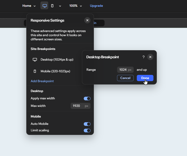
Open the Responsive Settings panel. Click the Customize Breakpoints icon at the top of the editor. Breakpoint management and the mobile settings are all in this panel.
Add a breakpoint. Click Add Breakpoint and pick Widescreen (1920px and above), Tablet (701px to 1023px) or Custom. For Custom, enter the maximum screen size in px and click Done.
Edit a breakpoint range. Hover over a breakpoint in the panel, click the More Actions icon and choose Edit. The smallest breakpoint takes a maximum, the largest takes a minimum, and all others take both. Confirm with Done.
Delete a breakpoint you no longer need. Use More Actions, then Delete, then confirm in the popup. The breakpoint below it takes over the range. All customizations made for the deleted breakpoint are removed from the site.
Set the canvas width. Open the breakpoint, click the canvas width field at the top right of the canvas, type a width in px and press Enter. The value must fall inside that breakpoint's range, and it applies to every page.
Let Auto Mobile handle the mobile layout. Auto Mobile is on by default. Structural changes on desktop, such as adding elements or moving them, are optimized for mobile automatically.
Turn Auto Mobile off for the site if needed. In the Responsive Settings panel, click the Auto Mobile toggle and then Turn Off in the popup. Adjustments already made stay in place, but new changes are no longer optimized for mobile. Click the toggle again to re-enable it.
Exclude a single section. Adjust that section's layout on the mobile breakpoint. This disables Auto Mobile for that section only.
Re-enable Auto Mobile on a section. Open the Mobile breakpoint and select the section. Hover over the Auto Mobile icon next to it, click Turn On for this Section, then Turn On in the popup.
Check limit scaling. Limit scaling is on by default. It caps how much elements grow on mobile screens of 700px and above, like a max width for mobile. Toggle Limit scaling in the Responsive Settings panel to change it.

Good to know
Adding, editing and deleting breakpoints affects the whole site, not only the current page.
A custom breakpoint adjusts overlapping ones. A custom maximum of 500px becomes the mobile breakpoint (320-500px), and 501-1023px becomes a tablet breakpoint.
Changing an element's responsive behavior on the mobile breakpoint disables Auto Mobile on its parent section. On larger breakpoints it does not, and the behavior is not applied to the element on mobile.
Turning Auto Mobile on for a specific section only works while Auto Mobile is enabled for the whole site.
Auto Mobile and limit scaling are independent. You can change one without affecting the other.
Wix's feature list adds that site-level breakpoints also cover global sections, and that font size can be set separately for each breakpoint.
parnii note
Decide on your breakpoint set before building detailed layouts, because deleting a breakpoint also removes its customizations. Before adjusting a section on mobile, remember that this takes it out of Auto Mobile.
FAQ
What breakpoints does a new Studio Two site have?
Two: desktop (1024px and above) and mobile (320-1023px). You can add Widescreen, Tablet or custom breakpoints from the Responsive Settings panel.
Will re-enabling Auto Mobile overwrite my manual mobile changes?
No. Sections you adjusted manually stay excluded when you re-enable Auto Mobile for the site. You can turn it back on for those sections from the mobile breakpoint.
Why can't I turn on Auto Mobile for one section?
Auto Mobile is probably disabled for the whole site. Re-enable it in the Responsive Settings panel first, then the per-section option becomes available.
Sources
Part of our Wix Studio Two series (Studio 2). Last checked: 06 November 2026.


